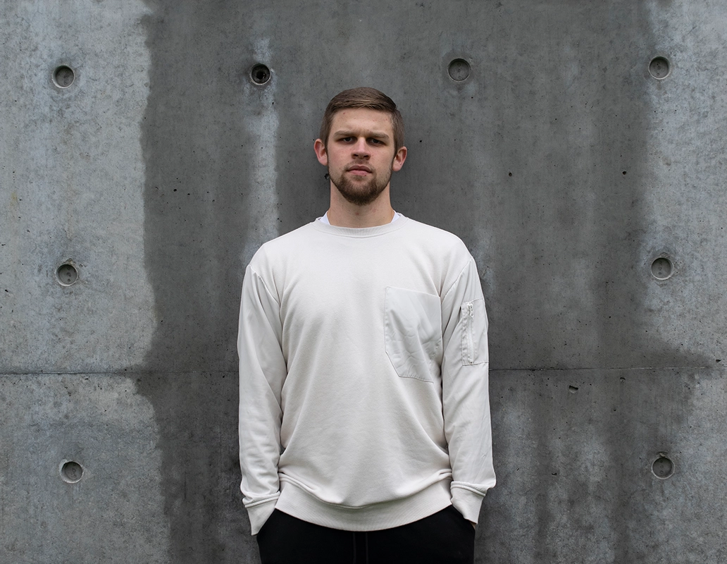
After growing up in the Midwest, I moved to Richmond, VA where I currently live with my girlfriend Jane and our two cats, Chamomile and Mimosa. I love to spend my time working on art and design projects, as well as exploring the city, mountains, and the beach.
Executing design tasks with excellence and a high attention to detail is of the utmost importance to me. I believe that exceptional design is achieved by aiming for the most ideal solution, not the easiest one.
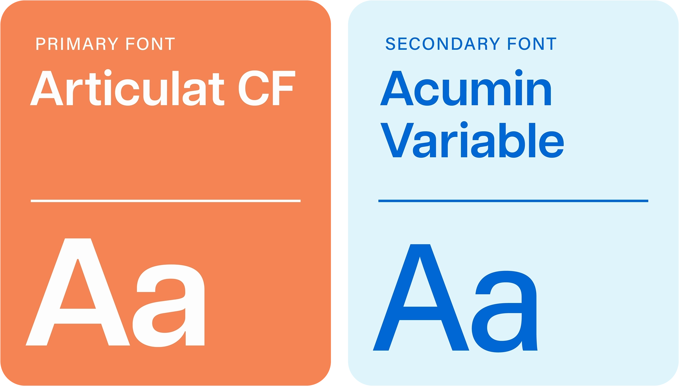
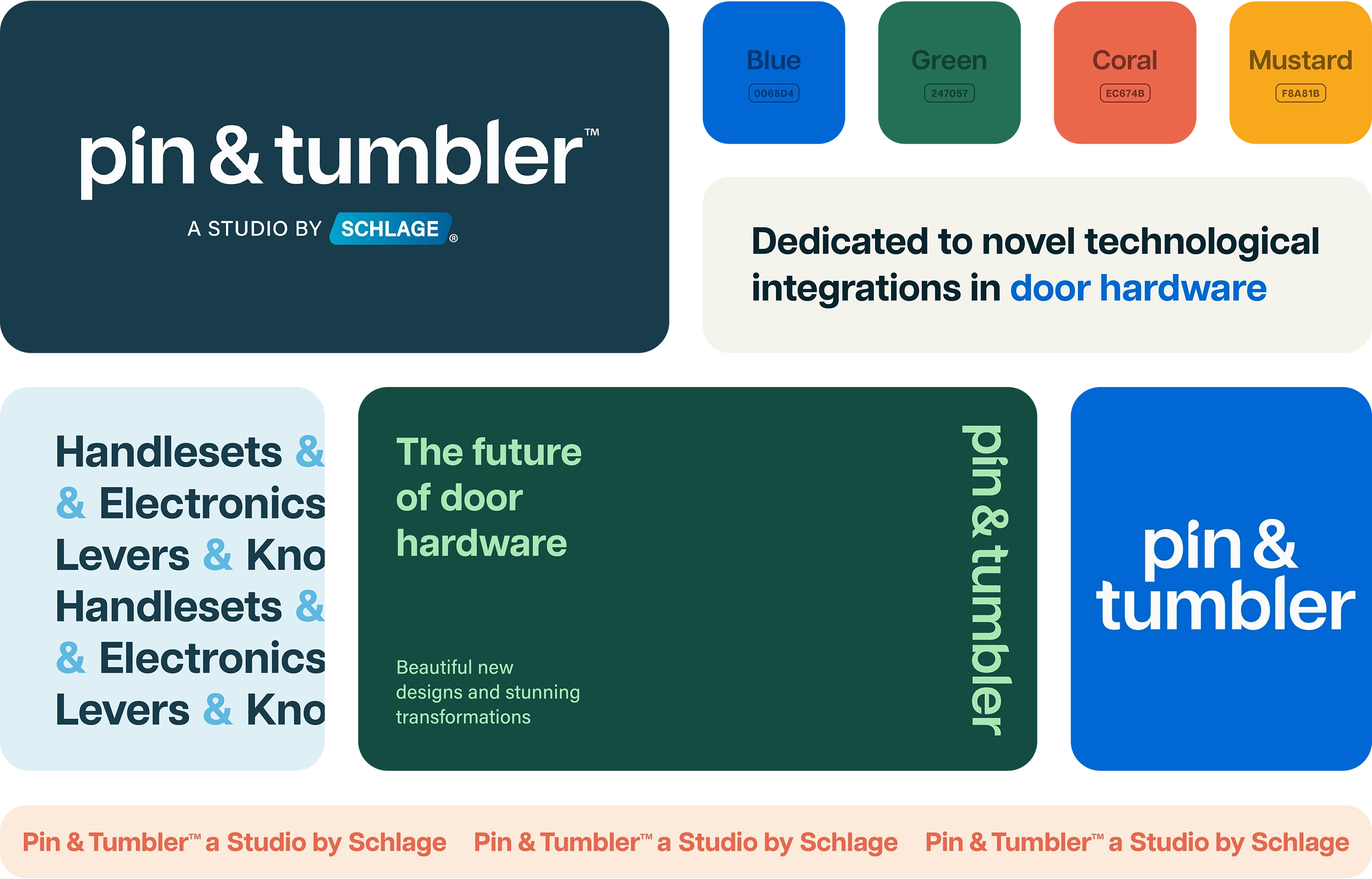
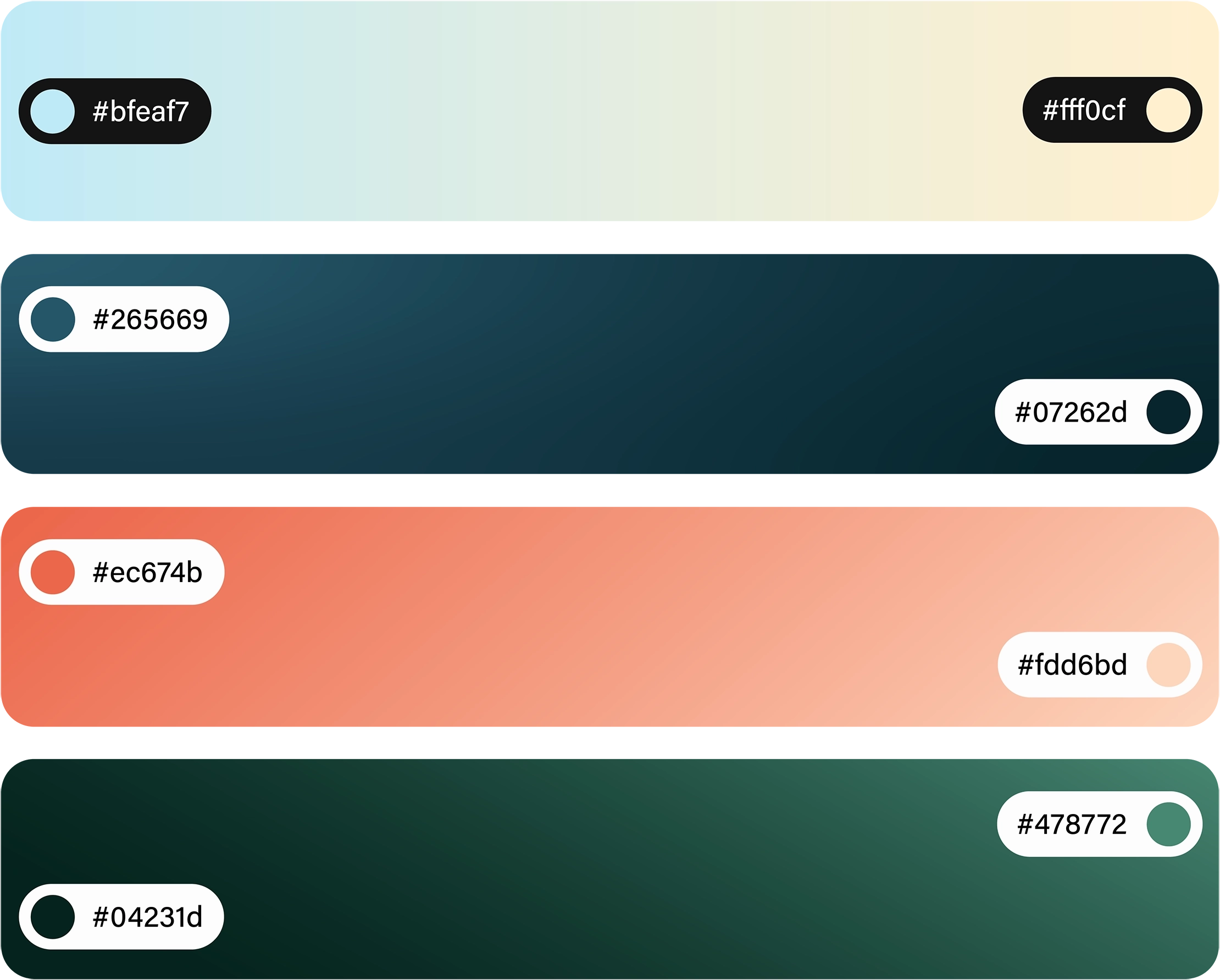
My passion for design is rooted in a long-standing interest in visual systems, user interfaces, and human-centered design. Having started my career in brand identity and marketing, I've since begun to build upon that foundation with digital interface work using design systems thinking.